You must log in or register to comment.
The article doesn’t do a good job of explaining the 40%
I thought the chart was pretty clear. Although I guess they could’ve color coded it.

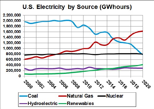
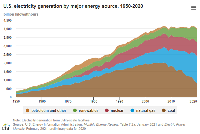
Here’s some overtime graphs up to 2020:


I think color coding it would’ve helped a bit yeah. Especially if they used the same color for wind and hydro and solar and nuclear. Otherwise you read 40% in the headline and the first thing which draws your attention is 44% natural gas
deleted by creator


