Oh geeze, I didn’t even see that. I assumed any mention of OsmAnd was on an Android discussion 🫢
Even the F-Droid version “OsmAnd~”, which is the premium version, but free?
My framework laptop has a built-in, physical kill switch for both the webcam and mic.
On my desktop pc, I cover the webcam or unplug it entirely until I need it.
Yeah, KF2 has a different “feel” to it for sure.
Speaking of enshittification, I tried out Payday 1 again… it’s so awesome to get in the game and play. Payday 2, as with KF2, went the way of DLC and presented the game as more of a marketing vector, rather than a product for entertainment.
The gaming industry really sucked the joy out of gaming with some of their decisions, and they only have themselves to blame.
KF1 was awesome. KF2 really stepped up the graphics… but then the enshittifcation began with DLC and adding pay-to-win content.
Because of that, I totally lost interest in KF3.
I am not sure on the other ones but Decathlon is 100% made in PRC.
I can’t say for sure 100% with my bike unless I check the label, but I see other bikes in the same series, with one being “Country of Origin: France” and the other “Country of Origin: Portugal”.
They are Decathlon’s own brand of bike, not just the store they were purchased at. 😀
Cause and effect. This is why many of us want to see alternatives to cars in our cities - because it makes life better for everyone, including drivers!
I’ll respectfully disagree, because there are plenty of studies that show a wide gap in understanding of road signs, with some being considerably more intuitive to understand than others.
As an example, have a look at the data below:
As you can see, the “no powered vehicle” sign (red line through it) was understood by nearly everyone, with no confusion.
Compare that to the “no cycling”, “no pedestrian” or “no motor vehicle” signs below:
You have mass confusion, with very few people actually knowing what the sign means before they are trained. To me, that’s a design flaw.
Other studies show a similar pattern.
This one for example, asked people from different countries to identify the meaning of various traffic signs.
I will point out that the ones which scored nearly perfectly identified, are the ones with a line through them; Signs with just coloured circles were very often misidentified, or understood as having the opposite meaning.
We can go back and forth on this (I don’t want to), and while I do agree that education can reduce the chance of a sign being misunderstood, that misses the point completely.
Wait, so beauty ads were NOT being served to teen girls already?
ur “do not enter” looks like this
See a line through the sign! /s
But in all seriousness, road signs need to be consistent and convey very quickly what the message is to a road user. If someone has to decipher that a red ring means “do not”, except for speed limits, then consistency is lost.
The problem I have with signs here in North America, is that they are largely just ignored 😫
Are your “do not enter” signs just the word ENTER, but with a red circle border? 😂 I’m kidding.
FWIW, he is facing trial. But every step of this case has been mishandled by the prosecution.
If the justice system is to be trusted, then this case should be dismissed, as it seems clear that he isn’t getting a fair trial.
For sure. I’ve purchased loads of stuff from Ali and have been pretty happy with the value, but hearing about someone’s experience is always helpful.
Thank you for the insight 😀
In fact most of the world uses a white sign with red border to mean a prohibition.
That’s crazy.
Like, this sign means maximum speed limit, not “don’t go 20”…
To me, it’s illogical.
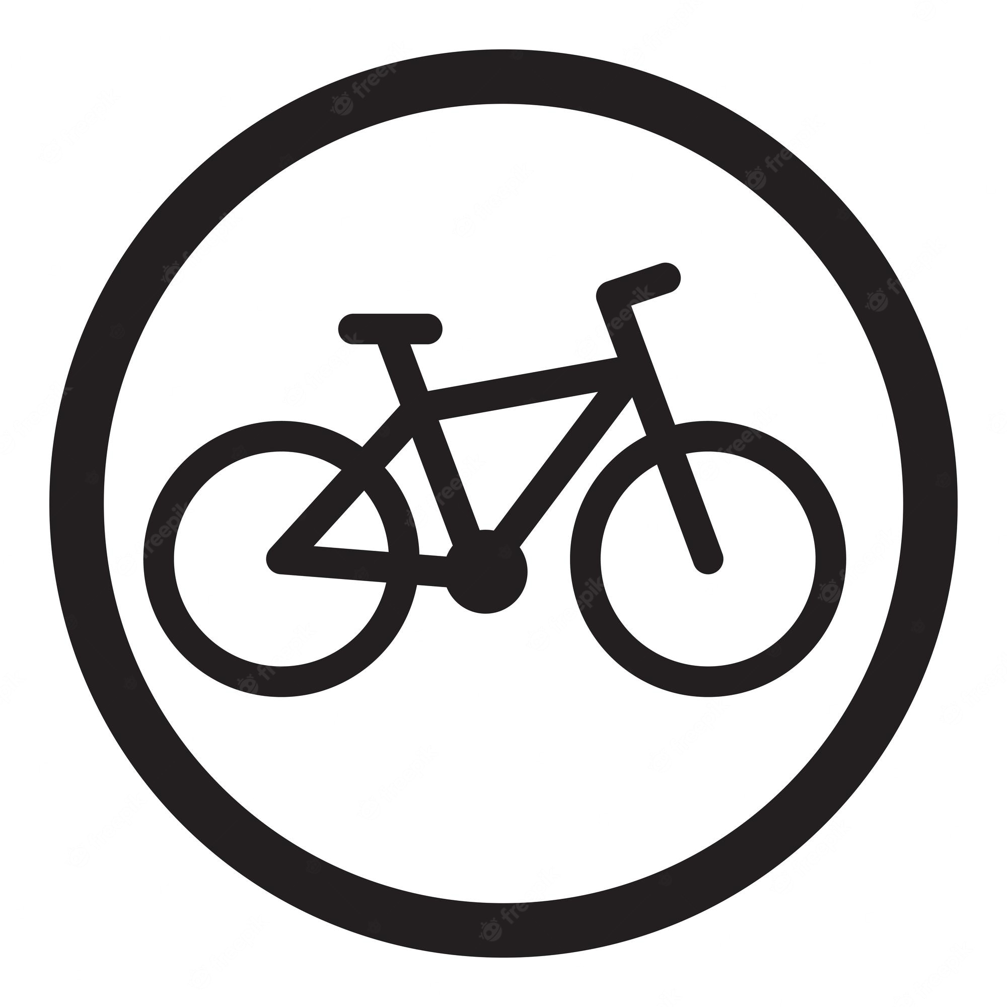
Like, how on earth would the right be better than the left in explaining that bikes are not allowed?
The use of a red border needs to be consistent, if it were to mean prohibition. Yet, it’s not 🧐
Accessibility needs to be universal. There may not be other signs like that in a particular city or country, but the rest of the world uses a line through “do not” signs.
Even a child could understand what it means, compared to different random coloured edge markings. And that’s exactly the point.
Which brand? I’m seeing so many sold, but then you look up reviews (not on the Ali site) and they are horror stories.
I’m tempted to buy some, but I’ve seriously had only one flat (my fault) with standard tubes over well beyond 14,000 km year round. So, I don’t want to introduce problems 🫣
Why wait? You still want to willingly give money to a hostile nation?
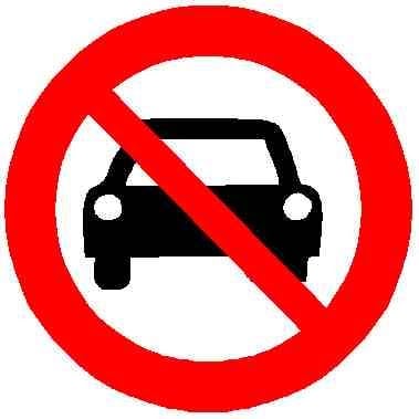
Poor design. If you were colour blind, that sign would be very confusing. It needs a line through it.
For example, these signs all mean not to do something, and anyone should be able to figure that out:
Can cities not just designate an unused plot of land to be used for temporary encampment with security?
Wild encampments do create all kinds of problems for communities, not only for safety, but for litter/human waste, vandalism, etc.
At least give people a “legal” place to pitch a tent, so they aren’t forced to live like fugitives. Nobody can expect the homeless to recover if they are constantly trying to find a place to sleep.